
In-app messages
Modals, slide-ups, and full-screen messages rendered inside your app. The right channel for product announcements, paywalls, onboarding nudges, "you just unlocked X" moments — anywhere a push would be overkill but a banner isn't enough.
- 1 · BuildContent & questions
- 2 · DesignTheme & layout
- 3 · TargetAudience · trigger · schedule · caps
- 4 · AnalyzePerformance & responses
Stage 1 — Build
Format
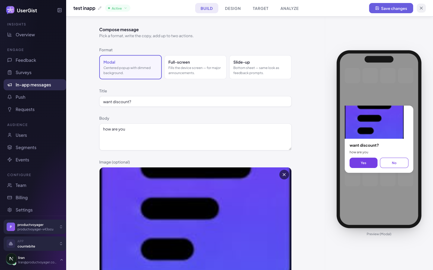
A 3-card picker. Pick one:
| Value | Dashboard label | Hint |
|---|---|---|
modal | Modal | "Centered popup with dimmed background." |
modal_full | Full-screen | "Fills the device screen — for major announcements." |
slideup | Slide-up | "Bottom sheet — same look as feedback prompts." |
Content
| Field | Notes |
|---|---|
| Title | Required. Placeholder What's new in 2.4. |
| Body | Required, multi-line. |
| Image (optional) | Image uploader. |
| Actions | Up to 2 CTA rows (see below). |
| Auto-dismiss (slide-up only) | Numeric input 1–120 seconds. Shown only when format is slideup. Leave blank to keep open until tapped. |
CTA editor — the 4 action types
Each CTA is a label + an action. Action picks one of:
| Action | Dashboard label | Hint | Target field |
|---|---|---|---|
open_url | Open URL | "Opens a URL in an in-app browser." | Yes — URL string. Placeholder https://example.com/promo. |
deep_link | Deep link | "Routes to a specific screen in your app." | Yes — your scheme. Placeholder usergist://feature/whats-new. |
dismiss | Dismiss | "Closes the message — no further action." | None. |
custom_event | Custom event | "Fires a named event your app handles." | Yes — event name. Placeholder feature_x_announce_clicked. |
The first CTA defaults to { label: 'Got it', action: 'dismiss' }.
Stage 2 — Design
Theme gallery + custom token overrides. Same tokens as Feedback.
Per-message tints (override the workspace theme just for this one):
backgroundColor— card background.accentColor— active button + scale fill.
The phone preview reflects the current format, copy, image, and theme.
Stage 3 — Target
Choose Audience, then Platforms, then Trigger. The platform section shows only the app's configured delivery platforms. React Native, Expo and Flutter offer iOS and Android; choose both for both app versions. Web covers mobile and desktop browsers and appears when enabled in app settings. See platform targeting.
Audience
Same 8 condition kinds as every other channel — see Segments.
Trigger
In-app uses the shared composer trigger builder, 3 kinds:
| Kind | Dashboard label | Hint |
|---|---|---|
app_open | On app open | "Fire when the user opens the app." |
event | When a user performs an event | "Fire when the SDK records a specific event (with optional property filters)." |
app_version_changed | When the user updates the app | "Fires on the first cold-start after the app version changes — perfect for "What's new"." |
The event kind exposes event name + property filters + occurrence (Every time / First occurrence / After Nth occurrence). All three kinds share Delay (in minutes), Once only (checkbox), and Active window (date range toggle).
audience_join is push-only and not shown here.
Screen context
Two chip lists let you scope where the message can appear, by the screen name your app reports via UserGist.setCurrentScreen(...):
| List | Dashboard label | Behaviour |
|---|---|---|
| Allowlist | Show only on | Empty = anywhere. Populated = only these screens. |
| Denylist | Never on | Always wins over the allowlist. Use for Checkout, SignUp, etc. |
Both are free-text chip inputs — press Enter to add, Backspace to remove the last.
Frequency caps
All 6 caps are exposed in the editor. Three are cooldown-by-outcome (the differentiator) and three are cross-pillar caps.
| Section | UI label | Field |
|---|---|---|
| Cooldown by outcome | Cooldown if shown (days) | cooldownAfterShownDays |
| Cooldown by outcome | Cooldown if dismissed (days) | cooldownAfterDismissedDays |
| Cooldown by outcome | Cooldown if CTA clicked (days) | cooldownAfterCtaClickedDays |
| Cross-pillar | Max impressions per user | maxImpressionsPerUser (1–100) |
| Cross-pillar | Per-pillar cap (days) | perPillarDays (0–365) — across all in-app messages |
| Cross-pillar | Global cap (days) | perGlobalDays (0–365) — across every channel |
For a paywall: cooldownAfterDismissedDays = 7, cooldownAfterCtaClickedDays = 30, maxImpressionsPerUser = 5. For a release-note takeover: maxImpressionsPerUser = 1.
Stage 4 — Analyze
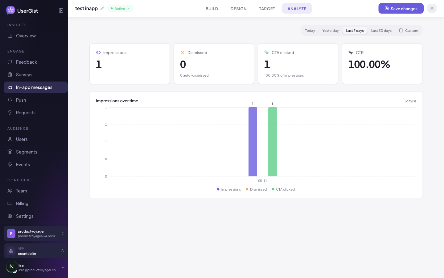
- Impressions — how many users saw it.
- CTA click-through rate per button.
- Dismiss rate —
dismissals / impressions. - Slide-up specific — auto-dismiss vs user-dismiss split.
- Daily time series of impressions + clicks.
Status lifecycle
| Status | Meaning |
|---|---|
draft · active · paused · completed · archived | Same lifecycle as surveys. |
SDK side
// Tell the SDK what screen the user is on, so screen context works
UserGist.setCurrentScreen('Home')

// Handle a custom_event action from a CTA
UserGist.setSurveyHandlers({
  onAction: ({ messageId, actionId }) => {
    if (actionId === 'open_pro_paywall') openPaywall()
  },
})
API
GET /v1/apps/:appId/inapp-messages— listPOST /v1/apps/:appId/inapp-messages— createPATCH /v1/apps/:appId/inapp-messages/:id— updateDELETE /v1/apps/:appId/inapp-messages/:id— permanently delete
Canonical schemas: apps/api/src/schemas/inapp-messages.ts.
Personalized content and actions
Use Insert field in supported message fields and button labels, destinations or JSON action values. The action editor groups Button label and Behavior, then the destination or Action data. Use one activity source for related movie title/ID/position fields and handle the resolved action in your app. Personalize messages covers user properties, latest activity, triggering events, fallbacks and Preview as user.
With the immediate-delivery API and SDK release, web plus mobile campaigns can return authorized content with event ingestion. Server eligibility and network latency still apply; eligible ordinary native campaigns keep cached matching.
What's next
- Features → Push — when in-app isn't enough
- Features → Segments
- Guides → Targeting recipes
Messages on websites
In-app messages also render in desktop and mobile browsers through the Web SDK. Include Web in Target, activate the intended user and grant feedback consent; analytics consent is needed to track trigger events. Set page context explicitly for screen allow/deny rules.
In Design, Web presentation sits beneath the theme and app backdrop settings. It controls the browser layout, size, side and backdrop. Desktop and mobile web previews share saved content and brand settings; desktop can be enlarged. These messages do not use browser push or notification permissions.